31 August 2014

Crafty Organisation

I find it is very easy for  all my crafting tools and projects to become very unorganised and as a result this makes me less likely to craft as I struggle to know where to start. Organising seems to be an on going job with everything in my house as I am a bit OCD with wanting everything to be in its place (this is hard at the moment as we only have two rooms and a small pantry cupboard for all of our things, I can't wait until our annexe is complete and our space more than doubles). Last night I decided I would start the re-organisation of my craft stuff by labelling my ink pads. This was the result:


My Tim Holtz distress inks (minus the 4 that were on my work table)


My current project (with my other distress inks)


A blending pad for each distress ink I own (labelled accordingly with the colours)

To organise my distress inks I used Tom's Dymo labelling machine to print two of each colour that I have (one for the ink pad and one for the bag with the blending pads). I know you can get the labels online but this way was much more efficient for me (no needing to look for sticky paper etc to print my labels and no fiddly cutting out to be done, which with this cold I was in no mood to do!)

My next wish organisation wise is a nice set of shelves in our new study above my desk so that I can position these ink pads with their labels facing out so at a glance I can see what I'm looking for, Tom agrees that it is a good idea, so fingers crossed it will happen!

Thanks for reading my blog on my organisational ideas for ink pads, I hope to post more on my different crafty organisational ideas soon,

- Rebecca

29 August 2014

My perfectly chewy flapjack

A quest for the perfect recipe for a particular thing like flapjack or shortbread or even the perfect victoria sandwich usually takes me through half a dozen recipes and adding my own adaptations before I get the answer (most of the time I don't try for the perfect item and just add my own adaptations to one or two recipes, week night dinners will be a recipe with my own tweaks or my own creation), I think I have finally, after a couple of attempts, come up with mine and Tom's favourite flapjacks (and some of his work colleagues' too, at least they keep asking for it!). I have decided to share it on my blog for all of you to enjoy too :D


Our favourite filling - dried apricots and pistachios


Cooking in the Oven


Cooling in the tin (this is crucial - have some patience)

(Please don't ask why I have done this in oz - I don't actually know!)

Ingredients:

- 10 oz porridge oats
- 4 oz self-raising flour
- 4 oz margarine or butter
- 5 oz rapeseed oil
- 8 oz soft brown sugar
- 4 tbsp golden syrup

Possible additions - nuts & seeds, dried fruit, ground ginger or cinnamon, lemon juice and zest. Our favourite combination (as pictured) is dried apricots and pistachios (not the salted kind), for a flapjack packed with fruit and nuts I usually use approximately 125g dried apricots and 100g pistachios - the pistachios really justify the presence of the nuttyness of the rapeseed oil.

Method:

1. Pre-heat the oven to 190 C (I use fan oven)
2. Melt the margarine and golden syrup together (we have a flat bottom 1000w microwave and I do it for two goes of 30 seconds each).
3. Meanwhile, mix the dry ingredients. Add the melted ingredients and rapeseed oil (we use local Yare Valley rapeseed oil from the local farmers market but any rapeseed oil will do) and combine.
4. Pour mixture into greased baking tin (line the bottom with baking parchment/greaseproof paper, I used a fairly standard size roasting tin with deep sides, make sure you grease these too) and spread evenly.
5. Bake in the oven for 15-20 minutes, until golden brown (the mixture will still be runny but will set while cooling in the tin).
6. Cut immediately into squares (or rectangles or fingers if you would prefer) but leave to cool in the tin, this is important - make sure you are patient!

Thanks for reading, I thought as this blog was supposed to be cookery too I ought to add a few posts on food,

- Rebecca

27 August 2014

Quick and Simple Birthday Card


This birthday card was made using scraps of card stock and patterned papers. I'm sure you all have some of those, whether you are the sort of person who saves every scrap of paper, even the smallest of small bits or someone who will only keep scraps over a certain size, if you are a crafter you will know how quickly these scraps amass! When my friend asked for cards to sell to raise money for her recently widowed friend I saw the opportunity to use up a small amount of my scraps!

First I matted and layered (past tense of to mat and layer?) my orange and yellow pieces of card stock, ensuring I cut away the middle from the orange so as not to let it go to waste as unseen (a nice thrifty technique which you can use when matting and layering, either on cards or scrap booking, just measure carefully!) After this I stuck a couple of narrow strips of gold border stickers either side. I then punched out my bunting, in co-ordinating colours, using the Stampin' Up pennant punch before adding it to my card. The 'string' was made by colouring plain white floss with pink and orange promarkers, I tied bows in the ends of my 'string' before sticking everything down. Finally I added the Happy Birthday peel-off in the bottom right-hand corner to complete my card.

I am entering this card into Pixie's Crafty Workshop Snippets Playground

Thanks once again for reading,

- Rebecca

26 August 2014

'Add Some Glitter' - Lavinia Stamps Challenge

Wow, two posts in one day, now that doesn't happen often! We risked the bank holiday weather to go to the Aylsham show, and we got soaked, perhaps not the most wise idea I've ever had, particularly as I was suffering the initial symptoms of a cold. This morning I woke up to a full blown cold complete with headache, sore throat and blocked sinuses, so trying to distract myself from being a miserable wet blanket I decided to have a look through some craft blogs for inspiration as to what to create today. As my mother's daughter it is only natural for me to like to add bling and glitter to my craft projects (though not as much as she would), when I came across the Lavinia Stamps August Challenge of 'Add Some Glitter' (HERE) I decided that this was what I would do today.

Now I sit here with glitter in my hair, on my face and all over my work surface (I wouldn't be at all surprised if I sneeze glitter at some point today) I need to write up the blog post for my competition entry, my brain is muffled from this cold so please excuse any typos, spelling mistakes or ramblings on my part!


Close up of the glittered seed heads

I started this card with a piece of card (6 inches by 4 inches) on which I had already created a blended ink background using 3 Stampin' Up ink spots (Real Red, Pumpkin Pie and Daffodil Delight) and a Tim Holtz blending tool. I have decided to do a line of cards like these (all different but along the same premise) so please keep coming back to see more of my projects using this technique.

The next step was to choose a Lavinia product to use, sadly I only have 2 sets (one borrowed from my mum), however I love the seed heads and hadn't up until today had a chance to use them. These stamps come straight in the packet but I decided to curve them on my project for a different effect, they are stamped with memento ink in Tuxedo Black, as is the Happy Birthday sentiment in the lower right hand corner. 

To 'Add Some Glitter' I used my Creative Memories glue pen (I actually prefer my sakura quickie glue pen but I couldn't get it to work) to add glue to some of the seed heads, I did this one colour at a time, the image on the right was sprinkled with red glitter whilst the left uses orange glitter.


The finished product

Thanks again for reading my blog, please do follow me for regular inspiration, it's great to share ideas with like minded people, back to bed I go armed with a big mug of lemsip, my hot water bottle and a box of tissues,

- Rebecca

PS - apologies that my instructions aren't as clear as usual, the cold had numbed my thought processes today!

Kiss Stamped Congratulations Card

I've seen several cards recently (mostly on Pinterest - not that I am obsessed with it in any way, shape or form!) using a bouquet of flowers as the focal point to the card, whilst I like what I have seen I am not generally one who will stick to designs she has seen before, I wanted to make mine slightly different. I took the inspiration for this card from the lovely hydrangea, it is fast becoming one of my favourite flowers :) This congratulations card was made for a friend who has recently passed their LPC exam and obtained a training contract to pursue her legal career, as many of my university cohorts (I graduated with a 2:1 in Law last July) are in the process of doing (strangely enough this wasn't for a friend from Uni, rather a mutual friend of Tom and I).


The Finished Card

My legally logically mind isn't as logical when I am being creative, sometimes I will create my base card first as would be logical but sometimes I do not, with this card I actually went straight into stamping my flowers (I didn't know what sort of card shape or size I wanted until I had a play around with my flowers first). The majority of the flowers are stamped in plain colour (Orchid ink from Oakhouse Studio), then there are a few where I had a play with a technique I had read about and decided to look up on youtube (my go to place - I don't like reading instructions!) - Kiss stamping. To use this technique you first ink up a plain palette stamp (i used the same flower as my base flowers - from the Spring Blooms set by Oakhouse studio), you then use a patterned stamp (I used the Oakhouse Studio medium Walesby heart) with no ink on it and press it into your palette stamp, removing it smoothly  to leave you with a patterned palette stamp, stamping this will produce a kiss stamped image.  Ensure that you remove all traces of ink from your patterned stamp between impressions, as this could leave you with an imperfect impression on the next image. Once I had  enough flowers to create my bouquet I cut out all of my flowers and played around with their arrangement until I was happy with it.

Before I could stick my flowers to a base card, I had to create that base card! This card is made out of an A4 piece of cream linen cardstock, I then used my Orchid ink to ink around the edge before heat embossing it using clear embossing powder (I also did this to the secondary piece of card that I decided to mount to the base card). Initially I had decided to colour my own floss but on a visit to my parents I found that my mum had the perfect floss for my design, pre-coloured so I decided to not fuss with colouring my own (usually though I do like to, it is another thrifty technique for saving money to spend on other things!). The floss was attached to the card by using a piece of double sided sticky paper, starting in the middle of my bouquet. I then arranged my flowers and stuck them down, lifting a few with double sided foam pads for dimension. My card was completed with 3 touches - tying a bow around my 'stems', sticking lime green gems to co-ordinate with the stems to the centre of the raised flowers and finally by stamping Congratulations in Spring Green (Oakhouse Studio) on a separate piece of card and mounting it with 3D foam in the lower right hand corner.


Closer look at the flowers (though sadly not the best photo for looking at the kiss stamping up close, and I can't take another as I have already given this card)

Thanks for reading,

- Rebecca

23 August 2014

Home Decor

The building of our 'annexe' is almost done, its water tight at least, waiting for the electricians to do their thing this weekend ready for the plasterers to come in and we will be one step closer! I was too excited to wait to make the first hand made item to fill the walls with colour (apparently we will have to wait at least 6 months to wall paper and paint in COLOUR), so I am eager to not live in a completely off white home for that long, hence the need to get creating to inject a little colour :) As an aside, however I do get my lovely red kitchen from the off! The wall hanging below is for our living room which will ultimately be lime green and grey.

Close Up

Hung on a wall using two different green and 2 different grey/silver ribbons

The MDF heart is a product from the MDF man (google him, he is brilliant!). I started by applying a layer of gesso as a preparatory layer (to 'seal' the MDF so I didn't need to use as much acrylic paint. This shade of green was made by mixing a shade of green acrylic paint I happened to have with some cheaper white acrylic paint to lighten it (I try to be a thrifty crafter where I can, as then I can buy more things!). After this, I sprayed the whole heart (outside, so as not to catch the desk - i've now bought a cat litter tray (as advised at the techniques workshop I went to) so I can spray to my hearts content even when the weather isn't good, we do live in England after all) with OHS spray ink in 'Pearly Silver' before stamping the OHS Walesby Heart and Gingham Border in green ink (I made this a few weeks ago and can't remember what shade it was so forgive me) to add texture to my background. The border was created by laying green (exhausting my collection of lime green buttons - an excuse for a shopping trip!) and grey buttons around the outside to find out how many I needed before sticking them on with Cosmic Shimmer glue for the flat buttons and silicone glue for the buttons that did not sit flat (after removing their backs as best I could with my Tim Holtz scissors). The Home Sweet Home was stamped and then green ink was blended into the paper using my mum's Inkylicious brushes (I need some of these and so do all of you!).

I am quite pleased with the result I have achieved, though as usual it isn't anything like what I had first envisioned! Thanks for reading my blog,

- Rebecca

Left: a mottled tie-dye-esque design I decided not to go with! Right: my base colour before any additions

19 August 2014

Techniques Workshop

Last weekend I went to a Techniques Workshop taught by my Mum (Lynne Vowles) and Barbara Daines both from the Design Team of Oakhouse Studio (yes I know I keep mentioning this brand but they really do have some nice products thati enjoy working with, I think with crafting you go through a phase of liking one brand and then another company brings out some new goodies and you buy and use them for a while instead though you still enjoy the previous brand and often go back to it or use it alongside different brands). Anyway I digress, this workshop was most enjoyable, whilst I didnt actually learn anything new I still enjoyed creating with like minded people, something I don't often get the opportunity to do.


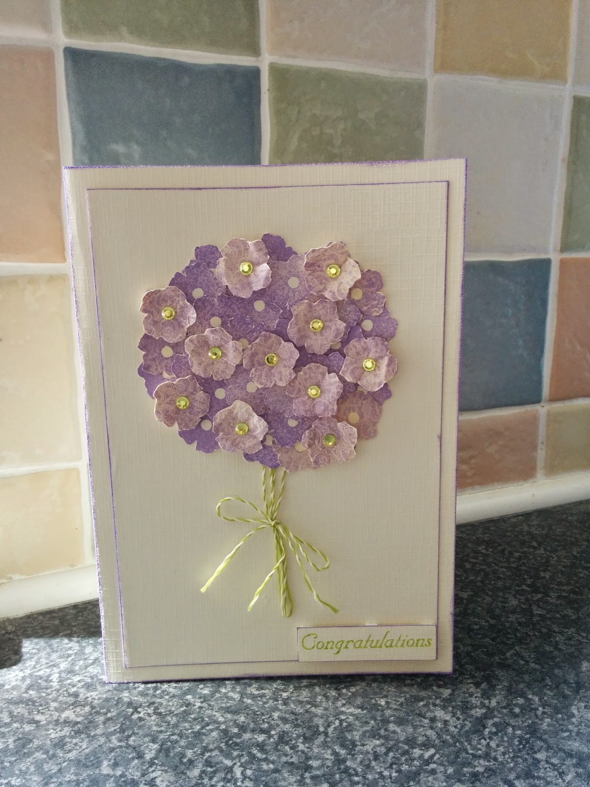
To create this card, we had two pieces of card, one for the baseand the second we tore in half (to avoid straight lines) to make masks. Once we had masked off two sections of our base card we took our chosen colours (mine were Golden Yellow, Lemon Yellow and Spring Green) and applied them to our basecard, blending carefully using the Tim Holtz blending tool. Once we were happy with the results (or not, yet still finished) we removed the masks to reveal our design. The class were supposed to stamp directly on to this and then use a sentiment or a quote to finish it off, me, being the class rebel decided to go off piste. I stamped the Oakhouse Studio Spring Blooms flower in Archival Ink (coffee) and then stuck them to my background, using sticky foam pads on a couple to add dimension, I then rejoined the class and stamped my sentiment in the same colour as my flowers, to finish I mounted it on brown card and then created a card to stick it to (using a card folding board).

When I got home I decided that there was something missing and added tiny gems (in co-ordinating colours) to the centre of the flowers (they weren't self adhesive so I am sure you will all appreciate how fiddly this was). As a final touch the I was dotted with a tiny gem.


The background for this 'Love' card was created in the same way as the previous card. I stamped one of the medium Walesby hearts and then masked it off using a special post it note which is sticky all over (my mum found these in W H Smiths) which I had stamped the same stamp and then cut round so it was the same shape. This meant that I was able to stamp the heart on the card again to create the effect of the two hearts being interlocked. Again tiny gems were added to the card to finish it off, this time within the tiny circles of the Walesby heart design. The final flourish was added by stamping love. This time I mounted my base on black card before sticking it to a blank card I had made.


This final card was the trickiest to make as there were so many steps and time lapses where it needed to dry. The first part of the morning was used to create a varietyof background papers using spray inks, such as Dylusions,  Cosmic Shimmers and Oakhouse Studio Colour Chemistry sprays ( I used the Oakhouse Studio sprays for the above backgrounds though I can't remember what colours I used other than Paris Pink).

After lunch these had dried sufficiently for us to move on to the next step. First we had to chose which background we wanted to use, this took a while as I couldn't decide the colour combination that I wished to use!! We all stamped the Oakhouse Studio Clematis Tower (twice) on to our backgrounds using Versamark and then heat embossed them in our choice of colour (I used Sea Foam White from Oakhouse Studio). One stamped image was cut out as a whole (though there was a bit of moaning about fiddly cutting out and most people cut off the small leaves). This was then stuck to a piece white (or black) card measuring 5 and a quarter inches, I stuck mine using 3D foam though some people simply stuck theirs flat, we were supposed to curl the edges of the image but I forgot!! I am still happy with how it looked at that point, however it looked better once I added 2 flowers,which had been cut out of the second image, using 3D foam.

This card was not completed at the class because I wanted to use some products from home. The Without Change sentiment (from you know where) was stamped in Golden Yellow and embossed using crystal sparkle embossing powder. Before mounting on the backing paper I added a few butterflies (actually from a nail art set from the Pound Shop, you can get some real bargains for crafting from there if you look carefully enough).

I am donating these cards to my friend (who i mentioned in a previous post) who is selling hand made items to raise money for her young widowed friend. If you would like to contribute any hand made items to this cause Zana would be very grateful, as would I, please let me know. Thanks for reading,

- Rebecca

11 August 2014

English Garden Words Tags

Hi all, another post from my very productive holiday, I have made/finished off more in the last 5 days than I have in a couple of months, I guess my mum has provided with motivation (and different toys to play with!)


'If friends were flowers I'd pick you'

The first tag ('If friends were flowers I'd pick you') was made by stamping the English Garden words (by Oakhouse Studio the stamp of the week, there are bargains to be had at www.oakhousestudio.com) in golden yellow and lemon yellow. I then punched flowers in two different sizes out of the stamped images (stamped on Oakhouse Studio stamping card). The tag was made by using my new favourite toy, only borrowed sadly, the ink duster brushes with the same colours as the stamped images, the tag was again made using Oakhouse Studio stamping card. The 'bouquet' of flowers was made by arranging the flowers at random in a circle working towards the middle, finished off with a tiny flower in the middle and faux stitching. The flower stems are made using the promarker leaf green floss with black dots added. The words were added as an afterthought, though I am not happy with their placement as it looks cramped.


'How does your garden grow'

The second tag ('How does your garden grow') was again made with the English Garden words stamp and I have used it as my second entry for the 'Alphabetica' challenge for Oakhouse Studio. The stamp, as I may have mentioned previously is currently stamp of the week and thus half price. This tag was fairly quick and simple to make, though I still like how it looks.  The tag is an Oakhouse Studio tag and the background was created by Stamping the English Garden Words in lemon yellow, cobalt blue and spring green. I only inked part of the stamp each time as my tag was relatively small and would not have fitted the whole image in each colour. I had already inked, punched and coloured the flowers in orchid for a previous project, they were also stamped with the Walesby heart before being punched out to add texture to the shape, I added bling to the centres and stuck them to my tag. The next step was to create the stems, I coloured plain white floss using a leaf green promarker and then attached the stems to the tag using a double sided sticky sheet. Finally I added the butterflies as a finishing touch.


Both Tags

I haven't decided what to do with these tags yet, I think I will either stick them to card blanks (and of course decorate the cards slightly too) or use them as gift tags for special summery gifts.  Thanks for taking the time out of your undoubtedly busy lives to read my blog and apologies for the quality of the photos, I will try to rectify this soon (once I'm reunited with my computer and my chief photographer!),

- Rebecca

10 August 2014

Alphabetica Challenge: Entry 1

The challenge over at Oakhouse Studio (oakhousestudio.blogspot.com) is 'Alphabetica', incorporating letters, words and numbers, or any combination of the above. Almost instantly I thought of something like the piece below.


Finished frame (ready for a photo)


Back of the stand


Front of the stand

This frame and stand set are made out of chipboard, I then painted them with Paperartsy Fresco paint in 'Honeydew'. Next I stamped letters all over the frame in both upper and lower case, starting with the palest colour (lemon yellow) before the middle colour (golden yellow) and the final colour (spring green). All of the inks were bought from Oakhouse Studio. Finally I used my ink duster brushes (ok my mum's ink duster brushes, though they are on my wish list, or perhaps I can sneak them into my suitcase later! These are the brushes I have mentioned in previous posts and not remembered the name), to colour the edges and the stand with the same colours that I used for stamping with.

I feel that this would be a perfect frame for a baby photo, and thus could make a perfect baby shower (as it is gender neutral) or christening gift.

Thanks for having the patience/interest to read my ramblings,

- Rebecca


RSVP card

This card took me an age and a half to complete, im not exactly sure why, I think mostly because I was unsure of the direction I wanted to go in. The omly brief I had was bright colours when I asked about the wedding colour scheme. 


I was reasonably pleased with how this card turned out, though my new camera woild have captured it better with some help from my chief photographer! 

The background of the card was again made using Tim Holtz distress inks and a blending brush, I love the effects that the brushes can give, watch out for a post soon on my first entry for the OHS 'Alphabetica' challenge which uses these brushes and some lovely bright citrus colours from OHS.  I hope to publish that blog post in the next couple of days, though I am waiting for some nice weather for some out door photographs!

The flower was produced by cutting out multiple copies of a heart I drew (as it was related to a wedding). I then stuck the first layer of the flower down before stitching down the centre of the top hearts using a similar colour of thread, I always like to add dimension to my cards where possible. I used 2 different size of buttons as the centre pieces. The stem of the flower was made using a piece of rick rack, stuck on another piece of ribbon and super sticky tape. This card did not turn out how I had envisioned at all, but I guess that's an aspect of crafting, you have to play with ideas to produce an overall result that you are happy with :)

Thanks for reading,

- Rebecca

It's all weddings and babies!

One scroll through my facebook feed and you'll regularly encounter one or all of the following; someone getting engaged, someone getting married or someone having a baby, I guess I have got to THAT age though not to the stage where I want any of the above! Anyway I waffle, the project for this post is not a competition entry, for once, it is a card and envelope I dreamt up to give to one of Tom's old school friends and his new wife on their wedding day :)


It is fairly simple in both design and execution but I feel it delivers a great effect all the same. Yet another card using simple matting and layering, with a white on white design, highlighted with gems down the centre of the butterfly in colours matching the wedding invitation sent to us. The card is finished off with a swirly congratulations, stamped in yellow to match the middle layer of card stock. Once again, a thrifty crafting technique was used by removing the centre of the yellow mat to use on another project.

The envelope is also intended to co-ordinate with the yellow used in the card. The corners were stamped in versamark, using the OHS medium walesby heart, and then embossed to add intrigue and texture.

Apologies for the poor quality of the photo, I intended to get a better one but my boyfriend put in straight in the envelope after he had written it!

Once again thanks for taking an interest and the time to read my post,

- Rebecca

9 August 2014

Something to try!

Just a very quick post of something I want to try, and I believe some of my readers may want to try or have indeed tried already!


These were our name places at a wedding we attended in St Andrews recently. The hearts are made by cutting out salt dough and then I believe the namss were stamped using alphabet stamps. A real personal touch was added by using friends nicknames, hence 'Ginge'. There were many crafty touches to this wedding which I loved! This included a 'name tree' which used each guests' finger print to create a leaf on the tree with the guest's name underneath their print, alongside the standard guest book for everyone to sign :)

Thanks again for reading,

- Rebecca

Floral Birthday Card


A birthday card to share with you today, just a quick post, unlike the card it features which took quite a while with many stages.


 Choosing papers for my flowers


Inking the edges of the flowers


Not quite the finished result

First I created a coloured background using Tim Holtz distress inks and blending brushes (produced by Inkalicious, and bordowed from my Mum, I NEED someof these brushes!) Next I had to search through my rather large pile of patterned papers (which desperately need organising) to find papers with co-ordinating colours to use for my flowers. The flowers are cut using a Tim Holtz die ( I cant remember which off the top of my head). I then inked around the edges with distress ink to add a distressed effect to the flowers.

The text was created using the small Creative Memories circle punch (sadly no longer available in this country). I then used an alphabet stamp set that my mum was given for her, which has turned out to be a very versatile set! The letters were stamped using a variety of colours of archival inks.

Finally I had to decide on the structure of the card. In the end the flowers ended up down the left handside and also along the bottom (being careful to make sure it would still stand up). The text remained in place and I added butterflies between each row of text as well as at the top and bottom. To finish the card off I added trails behind the butterflies. I will try to find  picture of the completed card to add to the blog.

Thanks for reading,

- Rebecca

Something Blue

As those who have read several of my blog posts by now will realise, I am a big fan of the Oakhouse Studio products and the competitions using them. In June, the brief was to, using at least one OHS product, create something incorporating the theme 'Something Blue'. This is my entry:


The sides of the box/pot


The top flaps


The completed card

When I heard the brief the first idea that popped into my head was the old wedding requirements of 'Something Old, Something New, Something Borrowed and Something Blue', so I decided to make a wedding card (as it turned out, this card was actually sent to some friends as a thank you for inviting us to their wedding, a little different to the intended use.)

As promised on a previous post, this card is made using the same principle as my flower pot card but with a twist.

Thanks for reading,

- Rebecca

5 August 2014

A foodie post!

Well, this blog is supposed to be for both my crafting and cookery posts, so I think it's about time that I publish a food post.

Tom has been mentioning for the last couple of years that he really likes Asparagus and Parma Ham tarts and when am I going to make him one, so a couple of weeks ago I realised that the asparagus season would soon be coming to an end and I ought to make him one!!

I found a recipe on the website of Delicious  magazine and decided that it seemed like the perfect recipe, especially the fact that it contained a certain brand of cream cheese with chives, which I knew would be popular with Tom!


Once again, this is not one of the best pictures I have ever taken, I am working on that and it should be easier now I have a new phone with a much better camera and a Tom who is interested in photographing my work for me.

The tart went down very well, although Tom said it wasn't what he had actually meant!! Ah well, he said it was better so I can't get too cross!!

Thanks for stopping by,

- Rebecca

Fiona's Birthday Card

I am always looking for original ideas for birthday cards, while I like a basic folded card it is nice to have a change every now again, so when I found this card that folds flat for posting and then stands up like a flower pot I had to try it. Luckily it was my best friend's birthday coming up so I had the perfect opportunity to use it!

 The box prior to construction

 Lots of stamped flowers

 The finished product!

First I folded, cut and scored my card stock to make the box/pot.  Next I added patterned paper to each side of my box/pot. Then I stamped the flowers, using two floral stamp sets from Stampin' Up. I used co-ordinating coloured ink to the card stock, this is a technique I really like, I think it looks really effective! The flowers were finished off by adding bling to the centres, as my mum would say if in doubt add bling or glitter! I put the flowers on 'stalks' and stuck them on to tabs that I had stuck in the box. I hope you all like the final product.

I love the fact that this folds flat for posting, otherwise I think it would be very difficult to send to anyone that does not live close by.

Soon I will post an alternative form of this card that I made for the June OHS 'Somethign Blue' challenge.

Thanks for reading,

- Rebecca

Swedish Easter Card

As I am trying to get this blog established I am trying to get lots of posts up so you can all see a variety of my creations. I imagine the frequency of my posts will tail off but I have every intention to try and post at least once a week.


Apologies for the terrible photo, it was taken in a hurry, using my old phone which had an appaling camera! This is an Easter card I made for Tom's Mormor (Grandma).

First I cut a circle in the base card using my Creative Memories shape cutter. I then used letter stickers to spell out Happy Easter in Swedish on to a blue background paper before sticking a sheet of acetate over the top and mounting it behind the circle. The butterflies were made using a variety of colours of Tim Holtz alcohol inks on foiled cardstock (made by sticking sticky backed foil to plain cardstock) and then punched out using the Stampin' Up butterfly punch. I then added antenna to the butterfly, using beading wire, this took a long time!!! The butterflies were then arranged around the circle, playing around with the placement before sticking them done.

Thanks all for stopping by and reading my post,

- Rebecca

4 August 2014

Congratulations Card

As promised here is a post about my third and final entry for the 'Happily Ever After' Competition.


Once again this card uses simple matting and layering of cream linen card stock with another colour, this time a nice purple DCWV white cored card stock (not that I highlighted the white core in this instance). The detailed butterflies are the Medium Charming Butterfly from OHS, which were stamped in a purple ink (the exact ink escapes me) before filling in the detail with a Versamark pen and embossing in a gold WOW embossing powder. The purple butterflies (using the smaller of the two Stampin' Up butterfly punches) were simply cut out of the backing purple card stock. The gold butterflies were punched out of the cream linen card stock which had been coloured using a gold tear drop brilliance ink pad. I couldn't resist making a co-ordinating envelope with my envelope board, they are so easy to use and make a multitude of different sized envelopes to fit various sized cards :D.

A friend of mine is collecting cards to sell to raise money for a friend who was recently widowed at the age of 29, I have given her this card, as well as others, to sell to raise money. If any of you would be willing to donate cards I am sure my friend would be very grateful. I will blog some of my other makes soon, thanks for reading my blog, please feel free to leave a comment.

- Rebecca


2 August 2014

Photo Frame

The Oakhouse Studio competition rules state that you can enter up to 3 projects per competition, so it would be silly not to take advantage of this opportunity, especially with my 'unluckyness'! I decided that I wanted to do something different than the standard card with my stamps. So I got my things together and sat down to play, below is what I managed to produce, it is far from my original idea and I am not 100% happy with how it turned out still, but I still wanted to share it with you all.


And a close up (before I added the bling).


Originally I painted the frame in cream and embossed the Oakhouse Studio Walesby Heart all over the frame with clear embossing powder. I didn't get the result I wanted so I sanded back the frame and repainted it in cream before attempting to distress it by dabbing on specks of gold paint with a piece of tissue paper. I was not happy with this either and so painted the frame in gold all over. Whilst I was doing this I decided I would try a technique that I had been meaning to try for a while, stamping with a clean stamp into paint to create texture. I did this using the Walesby Heart (I love those stamps!), ensuring I cleaned the stamp off between each impression so as not to spoil the image with the excess paint.

Once this was done I spent a couple of hours playing with ideas as to how to finish off the frame as it felt unfinished. In the end I use the medium charming butterfly (another OHS product), stamped it in gold on cream linen card stock and finished its antenna off with gold bling, sticking it in the lower right-hand corner. I finished the frame off with some pink bling to add a bit of colour and dimension (I am definitely my mother's daughter, you can't go wrong with a bit of bling)!

I hope you like it, I will hopefully be back on Monday with a post about my third and final entry,

- Rebecca


1 August 2014

Engagement Card

First and foremost this is my first post, and thus my first attempt at using Blogger, so if I make any mistakes I must apologise. A few weeks ago we headed to Scotland for a holiday followed by the wedding of one of Tom's old school friends. It turns out to be a double celebration as the day before the wedding, whilst we were having dinner with a group of Tom's friends, Jordan revealed that he and his girlfriend Agathe had got engaged a few weeks previously but he wanted to wait until we were all together to tell us. We were all very pleased for them and are looking forward to a trip to France in 2016 for the wedding! Below is the card I have made for them for their engagement, I also entered it into the Oakhouse Studio 'Happily Ever After' Competition.


This card was made using a simple matting and layering technique, inking the edge of the top piece of cream linen card in blue to tie in with the blue within the butterflies. The butterflies were made by stamping the butterfly from the Oakhouse Studio Triple Butterfly set, on a piece of background paper that I created using Tim Holtz Alcohol Inks on foiled card.

Since receiving a Stampin' Up envelope board I have begun to make and decorate my own envelopes to co-ordinate with my cards. I feel it adds a little intrigue and excitement on receiving the card instead of it being in a plain, I won't go as far as to say boring, envelope!

I hope you have enjoyed reading my first blog entry, please come back and visit my blog again soon!